Is your website optimized for mobile devices? In today’s digital landscape, where mobile usage has surpassed desktop, having a mobile-responsive website is essential for success. But what does it mean to have a mobile-friendly site, and why is it important? Let’s delve into the world of mobile optimization and discover how it can enhance your user experience and drive more traffic to your site.
Why Mobile-First Design Is Essential
Nearly 84% of the global population owns a smartphone, making it the primary way for people to access the internet. In fact, mobile traffic has surpassed desktop usage, accounting for over 54% of all web traffic. With such a significant shift in user behavior, prioritizing mobile-first design is essential for businesses to provide an optimal user experience.
Mobile-first design focuses on creating a website that is specifically tailored for mobile devices, ensuring seamless navigation, readability, and functionality on smaller screens. By optimizing your website for mobile devices, you can tap into a larger audience and prevent the loss of potential customers who expect a user-friendly mobile experience.
Failure to implement mobile-first design can have detrimental effects on user experience and business success. Mobile users who encounter difficulties with a website that is not optimized for their devices are likely to leave and search for alternative options. This can result in lost opportunities, decreased customer engagement, and ultimately, a negative impact on your bottom line.
To provide a compelling user experience, businesses must embrace mobile-first design principles. This approach involves considering the unique needs and preferences of mobile users and designing a website that caters to their requirements. By prioritizing mobile-first design, you can create a seamless and enjoyable user experience, increase user engagement, and ultimately drive business growth.
What Does Responsive Web Design Mean?
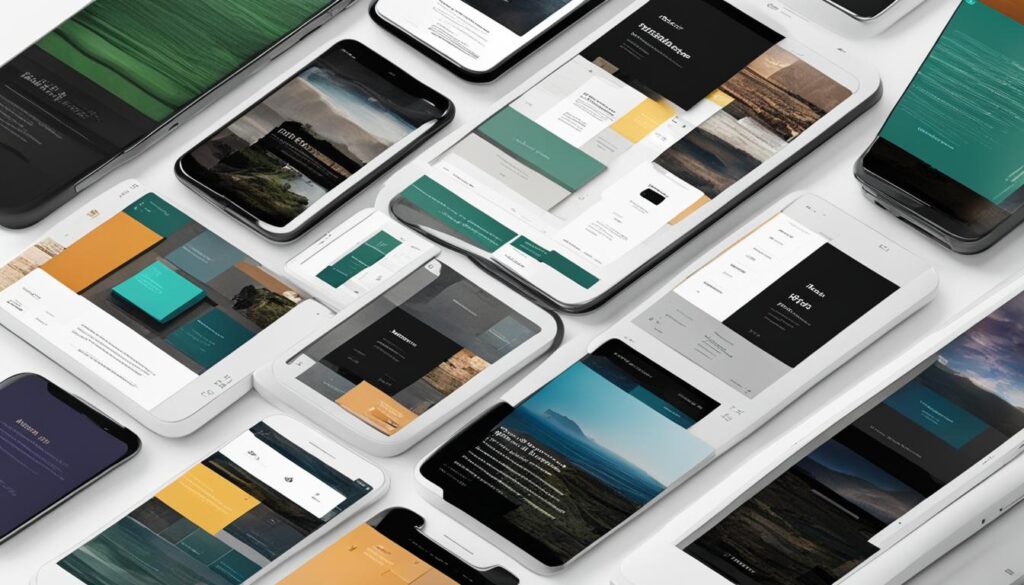
Responsive web design is a crucial aspect of creating a user-friendly website. It ensures that your site adapts seamlessly to different screen sizes, including phones, tablets, desktops, and even smartwatches. By employing CSS and stylesheets, responsive design allows your website to display and function optimally on any device.
Responsive design is different from adaptive design, which involves creating multiple versions of a page for different devices. With responsive design, you only need one version of your website that can automatically adjust to fit different screen sizes.
Responsive web design focuses on creating a flexible layout and fluid grid system that can adapt to the available screen space. This means that elements on your web page resize and reorganize themselves to best suit the screen they are being viewed on. By utilizing media queries and fluid CSS units, your website can respond dynamically to changes in screen size and orientation.
This approach ensures that your website remains accessible and user-friendly, regardless of the device being used. Whether your visitors are accessing your site on a small smartphone screen or a large desktop monitor, your content will be presented in a way that is clear and easy to navigate.
Additionally, responsive design eliminates the need for creating separate versions of your website for different devices. Instead, you can manage a single codebase, reducing development time and effort. This also means that any updates or changes you make to your website will be applied universally across all devices, ensuring consistency and efficiency.
The Benefits of Responsive Web Design
Responsive web design offers several key benefits for both website owners and visitors:
- Improved user experience: Responsive design ensures that your website is easy to use and navigate on any screen size, leading to higher user satisfaction and engagement.
- Higher search engine rankings: Google has emphasized the importance of mobile-friendliness in its search rankings, meaning that a responsive website is more likely to appear higher in search results.
- Cost-effective: Instead of investing in separate websites for different devices, responsive design allows you to create a single, adaptable website that works across all platforms.
- Future-proof: As new devices and screen sizes emerge, your responsive website will be able to adapt and accommodate them seamlessly.
With the increasing prevalence of mobile devices, it is essential to prioritize responsive web design to deliver an optimal user experience and stay ahead in the digital landscape.

| Pros | Cons |
|---|---|
| Adapts to various screen sizes | May require more advanced CSS knowledge |
| Improves user experience and engagement | May require redesigning existing websites |
| Cost-effective and efficient | Testing required on different devices |
| Future-proof solution | Requires careful attention to load times and performance |
How to Think Mobile-First When it Comes to Web Design
When it comes to designing a website for optimal mobile experience, it is crucial to adopt a mobile-first design approach. This means prioritizing the needs and expectations of mobile users right from the start. To ensure a smoother user experience and drive better business results, we need to consider the following:
- Understand Your Audience: It is important to have a deep understanding of your target audience and their mobile device usage habits. By knowing their preferences, you can tailor your design to meet their specific needs.
- Gather Customer Feedback: Customer feedback is invaluable when it comes to identifying areas for improvement in your mobile design. Ask for feedback from your mobile users and take note of their suggestions to enhance their overall experience.
- Analyze User Engagement Data: Analyzing user engagement data can provide valuable insights into how mobile users interact with your website. Pay attention to metrics like bounce rates, time spent on site, and conversion rates for mobile users. This data can help identify any difficulties they may be experiencing and inform design optimizations.
- Optimize for Mobile Devices: With the increasing usage of mobile devices, it is important to prioritize mobile optimization in your website redesign. Ensure that your design is responsive and adapts seamlessly to different screen sizes. Consider mobile-specific features such as touch-friendly navigation and accelerated mobile pages (AMP) to enhance the mobile experience.
- Iterate and Improve: Designing for mobile-first is an ongoing process. Continuously gather feedback, analyze user data, and make iterative refinements to your design. This will help you stay ahead of the curve and deliver a consistently exceptional mobile experience.
By following these steps, you can create a mobile-first design that caters to your audience’s needs, meets their expectations, and drives better business outcomes.

By prioritizing mobile-first design, you can ensure that your website is optimized for the growing number of users accessing the internet through their mobile devices. This not only improves user experience but also helps you reach a larger audience and achieve your business goals.
Hone in on Your Audience and Ask for Customer Feedback
When it comes to optimizing your website for mobile devices, understanding your audience is crucial. Analyzing analytics data can provide valuable insights into how mobile users interact with your site. Look for indicators such as higher bounce rates or less time spent on site by mobile users, as these may indicate a poor mobile user experience.
However, numbers alone may not tell the whole story. That’s why seeking feedback from your customers is equally important. Engaging with your audience and asking for their input can uncover any frustrations or difficulties they may have encountered while browsing your site on mobile devices.
This valuable feedback can guide your website redesign efforts and help create a more user-friendly experience. By addressing the specific pain points highlighted by your customers, you can optimize your website for mobile devices and ensure a seamless browsing experience.
“Our customers’ feedback is invaluable in driving our website redesign efforts. By listening to their experiences and addressing their concerns, we can create a more user-friendly mobile experience that meets their needs.”
By combining analytics with customer feedback, you can gain a comprehensive understanding of your mobile user experience. This data-driven approach allows you to make informed decisions and prioritize the elements that matter most to your audience.
Listening to Your Customers
There are several effective ways to ask for customer feedback:
- Implement feedback forms on your website, specifically tailored to mobile users.
- Utilize surveys or polls to gather insights and opinions.
- Offer incentives, such as discounts or freebies, to encourage participation.
- Engage with customers on social media platforms, responding to comments and direct messages.
- Initiate one-on-one conversations through email or live chat, actively seeking feedback.
By actively seeking customer feedback and incorporating it into your website redesign process, you can create a mobile user experience that resonates with your target audience. Taking their perspectives into account not only enhances user engagement but also builds trust and loyalty with your customers.
In the next section, we’ll explore the importance of optimizing your website for small screen sizes, ensuring a smooth and efficient mobile user experience.
Think Small (In Terms of Screen Size)
Optimizing your website for mobile devices requires careful consideration of the smaller screen size and the need for fast website loading times. When it comes to mobile site optimization, there are a few key factors to keep in mind: website speed, clutter, and responsive design.
Website Speed
Mobile users expect instant access to information, which means your website must load quickly. Slow loading times can lead to user frustration and a higher bounce rate. To improve website speed, minimize the use of large images, videos, or excessive animations that can slow down the loading process. Simplify code by removing unnecessary plugins or scripts that may hinder performance.
Clutter
When designing for smaller screens, it is crucial to eliminate clutter and focus on the most essential elements and content. Remove unnecessary pop-ups, excessive ads, and other screen inhibitors that may disrupt the user experience. Streamlining the design by simplifying layouts and navigation can help users easily engage with your website without feeling overwhelmed.
Responsive Design
A responsive design ensures that your website adapts seamlessly to different screen sizes, whether it’s a smartphone, tablet, or desktop. By using CSS and stylesheets, you can create a layout that adjusts and presents information clearly on any screen. This eliminates the need for separate versions of your website for different devices and provides a consistent user experience across platforms.
By optimizing your website for mobile devices and considering the smaller screen size, you can enhance the user experience and keep visitors engaged. Let’s take a look at some data on the impact of mobile-friendly design:
| Statistic | Mobile-Optimized Websites | Non-Optimized Websites |
|---|---|---|
| Mobile users bounce rate | 30% | 65% |
| Mobile conversion rate | 5% | 1% |
| Mobile revenue | $50,000/month | $10,000/month |
As you can see from the data above, having a mobile-optimized website can significantly impact user engagement, conversion rates, and revenue. The benefits of responsive design are undeniable, and investing in mobile site optimization is essential in today’s digital landscape.

Refine Your Design Aesthetic
When it comes to website design, aesthetics play a crucial role in shaping user experience and creating a professional appearance. Investing in a visually appealing and well-designed website can significantly impact how users perceive your brand and differentiate you from your competitors. A website that looks polished and cohesive instills confidence in potential customers and encourages them to explore further.
The design aesthetic of your website should align with your target audience and brand identity. By understanding your users’ expectations and preferences, you can create a visually engaging and user-friendly experience that resonates with them. Consistency in design elements, such as color palettes, typography, and imagery, contributes to a cohesive and professional look.
Professional appearance goes beyond aesthetics – it extends to the functionality and usability of your website as well. Smooth navigation, intuitive user interface, and clear calls-to-action are essential for a seamless user experience.
Creating a Visually Appealing Website
Here are some key design principles to consider when refining the aesthetic of your website:
- Use whitespace effectively to create visual balance and enhance readability.
- Choose a color palette that aligns with your brand and appeals to your target audience.
- Optimize typography for readability across different devices, ensuring the text is legible and coherent.
- Pay attention to the placement and sizing of images, keeping them relevant, high-quality, and optimized for fast loading times.
- Utilize visual hierarchy to guide users through your content and highlight important information.
- Consider the use of visual elements such as icons and illustrations to enhance the visual appeal and convey information efficiently.
Key Elements for Designing an Aesthetic Website
| Key Elements | Benefits |
|---|---|
| Consistent branding | Builds brand recognition and fosters trust with users |
| High-quality imagery | Makes the website visually engaging and enhances user experience |
| Intuitive navigation | Enables users to find information easily and enhances overall usability |
| Clean and organized layout | Improves readability and reduces cognitive load for users |
| Responsive design | Ensures the website adapts seamlessly to different screen sizes and devices |
| Accessibility considerations | Makes the website usable for individuals with disabilities and improves overall user experience |
By refining the design aesthetic of your website, you can create a professional and visually appealing online presence that enhances user experience and leaves a lasting positive impression.

8 Ways to Optimize Your Website for Mobile Devices
When it comes to mobile optimization, there are several key aspects that you should focus on to ensure a mobile-friendly experience for your users. By implementing these strategies, you can enhance your website’s performance on mobile devices and improve user engagement.
- Test with Google’s Mobile-Friendly tool: Use Google’s Mobile-Friendly tool to analyze your website and identify areas that need improvement in terms of mobile responsiveness and design.
- Simplify forms: Streamline your forms by reducing the number of fields and making them easy to fill out on smaller screens. Consider using auto-fill options to make the process more efficient.
- Optimize CTAs and clickable elements: Ensure that your call-to-action (CTA) buttons and other clickable elements are large enough and well-spaced to prevent accidental clicks on mobile devices.
- Avoid pop-ups: Pop-ups can be intrusive and disruptive on mobile devices, leading to a poor user experience. Instead, consider using less intrusive methods such as banners or slide-ins.
- Keep content concise: Mobile users have limited screen space, so it’s important to keep your content concise and easy to digest. Use headings, subheadings, and bullet points to break up the text and make it more scannable.
- Optimize page speed: Mobile users expect fast loading times, so optimize your website’s performance by compressing images, minifying CSS and JavaScript, and leveraging browser caching.
- Optimize images: Compress and resize images to reduce their file size without compromising quality. Use the alt attribute to provide descriptive information about the image for screen readers and search engine optimization.
- Provide a mobile-friendly design: Ensure that your website has a responsive layout that adapts to different screen sizes and orientations. Use mobile-friendly design principles to create a seamless and enjoyable browsing experience.
By implementing these optimization strategies, you can create a mobile-friendly website that provides a smooth user experience and improves your overall online presence.
Is Your Website Mobile-Friendly?
In today’s digital landscape, having a mobile-friendly website is essential for providing a seamless user experience to visitors accessing your site on mobile devices. A mobile-friendly website not only improves user satisfaction but also positively impacts your search engine rankings and overall online presence. If you want to optimize your mobile presence and improve user experience, it’s crucial to ensure that your website is designed and optimized for mobile devices.
Why Mobile-Friendly Websites Matter
A mobile-friendly website loads quickly, adjusts to different screen sizes, and offers intuitive navigation. It allows visitors to effortlessly interact with your content, browse through products or services, and easily complete desired actions. With more people relying on their smartphones and tablets as their primary devices for internet access, a mobile-friendly website can help maximize your reach and engagement.
Implementing mobile optimization is no longer just a nice-to-have feature; it’s a necessity in today’s digital landscape. Whether you’re an e-commerce store looking to drive sales or a service-based business aiming to increase leads, a mobile-friendly website is essential for achieving your business goals.
Testing Your Website’s Mobile-Friendliness

One of the first steps in assessing your website’s mobile-friendliness is to test it on different mobile devices. By using smartphones and tablets to access your website, you can evaluate the user experience and identify any areas that need improvement.
Focusing on factors such as load speed, ease of navigation, and clarity of information is crucial. Consider whether users can easily find what they’re looking for, navigate through different pages, and complete desired actions without any obstacles.
Design Improvements for Mobile Optimization
Once you’ve tested your website’s mobile-friendliness, it’s time to make design improvements that prioritize user experience and align with your business goals. Here are some essential design improvements to consider:
- Responsive Design: Ensure your website is built using a responsive design framework that adjusts to different screen sizes and provides an optimal viewing experience.
- Streamlined Navigation: Simplify your website’s navigation menu and make it easily accessible on smaller screens. Use clear and concise labels to guide users to the most important pages.
- Clear Call-to-Actions: Optimize your call-to-action buttons, making them prominent and easy to tap. Use clear and concise text to communicate the desired action effectively.
- Crisp Content: Adapt your content for mobile screens by using shorter paragraphs, bullet points, and headings to make it easy to read and digest.
- Visual Hierarchy: Prioritize important content and visual elements to ensure they are easily visible and accessible on mobile devices.
- Optimized Images: Compress images to reduce file size and improve load times without compromising image quality. Use descriptive alt tags to provide context to visually impaired users or in case the image fails to load.
- Mobile-Friendly Forms: Simplify forms by reducing the number of fields and optimizing their layout for smaller screens. Use input types that are mobile-friendly, such as number pads for phone number entry.
- Fast Load Times: Ensure your website loads quickly on mobile devices by optimizing images, minimizing unnecessary scripts and plugins, and leveraging browser caching.
The Benefits of Mobile-Friendly Design
“Having a mobile-friendly website not only enhances the user experience but also boosts your website’s visibility and performance in search engine results. By optimizing your website for mobile devices, you can improve your chances of reaching and engaging with your target audience, leading to increased conversions and business growth.”
Investing in mobile optimization and design improvements can deliver significant benefits for your business. From improving user satisfaction to enhancing search engine visibility, a mobile-friendly website lays the foundation for a successful online presence. Keep in mind that designing for mobile devices is an ongoing process, as technology and user expectations continue to evolve. Regularly evaluating and updating your website’s mobile-friendliness ensures that you stay ahead of the curve and consistently provide an optimal user experience across all devices.
Designing Your Website for Your Specific Business Goal
When it comes to mobile website optimization, it’s crucial to consider your specific business goal. Whether you want to increase online sales, drive phone calls, generate online leads, encourage store visits, or provide valuable information and awareness, your website design should support and enhance your desired outcome. By aligning your design choices with your business goal, you can create a mobile website that maximizes its effectiveness and delivers optimal results.
To achieve your business goal through mobile website optimization, here are some key design elements and strategies to implement:
- Simplify navigation: Ensure that your mobile website has a clear and intuitive navigation menu that allows users to find what they’re looking for easily. Streamline the navigation structure and use dropdown menus or hamburger menus to save space.
- Use click-to-call buttons: If your goal is to drive phone calls, incorporate prominent click-to-call buttons on your mobile website. These buttons make it convenient for users to contact your business directly from their mobile devices.
- Simplify forms: If you aim to generate online leads, optimize your forms for mobile devices. Minimize the number of form fields and use auto-fill options to make it easier for users to submit their information quickly.
- Emphasize your goal through design: Create a visually prominent and compelling design that aligns with your business goal. Use prominent call-to-action buttons, banners, or visuals that direct users towards your desired action.
By implementing these design strategies, you can effectively optimize your mobile website to achieve your specific business goal. A well-designed mobile website that caters to the needs and preferences of mobile users can significantly impact your online sales, phone calls, leads, store visits, and overall brand awareness.
| Business Goal | Design Strategy |
|---|---|
| Online Sales | Optimize product pages for mobile, simplify checkout process, offer quick access to customer reviews and ratings. |
| Phone Calls | Incorporate click-to-call buttons, prominently display contact information, use strong call-to-action statements. |
| Online Leads | Create mobile-friendly forms, utilize progressive profiling, offer incentives for form submissions. |
| Store Visits | Include store locator with maps and directions, highlight in-store promotions or exclusive offers. |
| Information and Awareness | Create engaging and informative content, implement visual storytelling, utilize social sharing buttons. |
Working with Your Web Developer
Collaborating with your web developer is crucial in implementing mobile-friendly design strategies. Whether you choose responsive design or opt for separate versions of your website for desktop and mobile, working closely with your web developer can ensure the best solution for your business.
Discussing website needs, resources, and goals with your web developer will help in creating a mobile-friendly website that optimizes user experience, search engine rankings, and overall website performance. By understanding your business objectives, your web developer can tailor the design and development process to meet your specific requirements.
Your web developer can guide you in choosing between responsive design and separate mobile versions based on factors like your target audience, budget, and functionality needs. They will have the expertise to determine the most appropriate approach and ensure that your website performs seamlessly on mobile devices.
During the collaborative process, you can share your ideas and expectations with your web developer, enabling them to provide valuable insights and suggestions for improvement. Together, you can brainstorm ideas to enhance the mobile user experience, align design elements with your branding, and optimize website performance.
If you choose to go with responsive design, your web developer will focus on creating a website that adapts and scales smoothly across different screen sizes. This approach often involves using CSS media queries and flexible layout techniques to ensure that the website responds effectively to various devices, providing a consistent and user-friendly experience.
On the other hand, if you opt for separate versions of your website for desktop and mobile, your web developer will design and develop two distinct interfaces that cater specifically to each platform. This approach allows for greater customization and optimization, enabling you to tailor the user experience accordingly.
Collaborative Process with Your Web Developer
When working with your web developer, it is important to have clear communication and establish a collaborative relationship. Here are some key steps to ensure a successful partnership:
- Define your goals: Clearly communicate your business objectives and desired outcomes to your web developer. This will provide them with a clear understanding of what you hope to achieve with your mobile-friendly website.
- Share your ideas: Discuss your ideas, preferences, and expectations for the design and functionality of your website. Your web developer can then provide valuable input and suggestions based on their expertise.
- Provide necessary resources: Ensure that you provide your web developer with all the necessary resources, such as branding guidelines, content, and images. This will help them align the design with your brand and optimize the visual elements of your website.
- Regular communication: Maintain open and regular communication with your web developer throughout the development process. This will allow you to address any concerns or make necessary changes along the way.
- Testing and optimization: Work closely with your web developer to conduct thorough testing on different devices and screen sizes. This will help identify any issues or areas for improvement, ensuring that your website is fully optimized for mobile devices.
By working collaboratively with your web developer, you can create a mobile-friendly website that meets your business goals and provides an exceptional user experience. Their expertise and technical knowledge will be invaluable in implementing responsive design or developing separate mobile versions, ensuring that your website is optimized for mobile devices.
Conclusion
Mobile responsiveness is no longer a luxury; it has become a necessity in today’s digital landscape. With the majority of internet users accessing websites through their mobile devices, optimizing your site for mobile responsiveness is crucial to provide a seamless user experience and stay ahead of the competition.
By adopting a mobile-first design approach, you prioritize the needs of mobile users and ensure that your website is compatible with various screen sizes. This not only enhances user experience but also improves your search engine rankings and increases the likelihood of converting visitors into customers.
Remember, mobile optimization is an ongoing process. Continuously monitoring user engagement, gathering feedback, and analyzing analytics data can help you identify areas for improvement and refine your design to meet the evolving needs of your target audience.
Investing in a responsive web design, optimizing page speed, simplifying forms, and honing in on your business goals will ultimately pave the way for a successful mobile-friendly website that delivers a positive impression and drives the desired actions from your users.